.png)
The Power of a Palette: Using Colour to Connect Your Home
- Jun 5, 2025
- 3 min read

Colour has a quiet authority. It anchors a space, sets its tone, and tells a visual story, one that unfolds room by room. When used thoughtfully, colour has the power not just to decorate a home, but to connect it, weaving subtle threads that tie spaces together.
At Maché Interiors, we often talk about colour not as a finishing touch, but as a design strategy, one that allows a home to feel cohesive, considered, and full of personality.
“As you move through a home, there should be a sense of gentle evolution, not jarring shifts. The most successful palettes are those that feel intentional, layered, and quietly expressive”
-Maché Interiors
Here's how we approach building a colour story that flows, delights, and endures across a home.
Start with the Feeling
Before diving into swatches, take a moment to consider how you want each space to feel. Calm and grounding in the bedroom? Crisp and energetic in the kitchen? Layering your emotional brief with your practical needs helps determine whether your palette should lean warm or cool, muted or saturated, tonal or high contrast.

Build Around a Core Palette
Once you’ve identified the mood, we recommend selecting 3–5 core tones that will form the foundation of your scheme. These may include:
A neutral base
A dominant colour used across large areas (walls, cabinetry, upholstery)
A supporting tone to bridge or contrast (perhaps in soft furnishings, joinery or painted doors)
One or two accents for energy and interest (artwork, tiles, a bold chair)
This doesn’t mean every room needs to feature the same paint, but repeating elements from this palette across your home gives a sense of ease and continuity.
Finding the Colours You Love
Before building your palette, take a moment to reflect on the colours that instinctively feel right to you. This isn’t about chasing trends; it’s about creating a home that reflects your personality
Start by noticing the tones you naturally gravitate towards in your wardrobe or the spaces you’ve loved spending time in. Think in terms of how colours make you feel, not just how they look.
Maché Tip - It also helps to gather a few references - artwork, fabric, nature, or travel imagery and look for recurring tones, moods or themes. Often, a colour story starts to reveal itself once you stop overthinking and start noticing what you’re consistently drawn to. From there, it becomes less about “choosing the right colour” and more about curating a palette that feels intuitively you.

Transition, Don’t Repeat
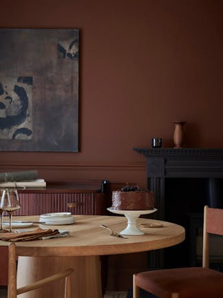
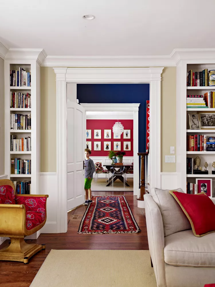
Rather than duplicating colours from room to room, think in terms of gradual transitions. For instance, a deep navy in the hallway might soften to a misty blue in the living room, then fade into a grey with a blue undertone in the bedroom. This tonal layering allows each space to have its own identity while maintaining visual continuity.

Play With Contrast
A cohesive palette doesn’t have to mean “matchy.” In fact, a touch of contrast can bring a scheme to life - but it works best when it feels deliberate. For example, a warm, natural-toned home might come alive with a burst of terracotta in a snug or study. Or a calm, neutral living room might benefit from a bold, colour-drenched cloakroom to surprise and delight.
We often use colour proportion to manage contrast, letting accent colours appear in smaller doses, repeated in a few well-chosen moments, rather than taking over.
Think Beyond Paint
Colour lives not only on walls, but in the texture of stone, the grain of wood, the patina of brass, or the softness of upholstery. Don’t be afraid to let materials take the lead, a warm oak floor or veined marble countertop can inform your palette just as much as paint can!


_edited.png)
Comments